
Mobile APP CONCEPT
Safer Waiting for Riders: Deep Dive into Uber's UX
Safer Waiting for Riders:
Deep Dive into Uber's UX
team
Just Me!
Just Me!
EXPERTISE
UX/UI Design
UX/UI Design
tIMELINE
2 months
2 months
The Basics:

The Basics:
The Basics:
What does Uber already offer?
Uber has made significant safety advancements for riders: location sharing, ride tracking, driver ratings, and emergency calling features. However, there is still a gap in the pre-ride phase:
Anxiety during wait times is rarely addressed
Visibility, safety cues, and environmental awareness are limited
Riders often check other apps for nearby stores or street activity
This left an opportunity to improve rider comfort and perceived safety in the minutes between booking and pickup.
User Research:
Understanding rider fears and behaviors
I conducted 10 short interviews and 2 survey blasts (50+ responses).
Some key patterns emerged:
Understanding rider fears and behaviors
I conducted 10 short interviews and 2 survey blasts (50+ responses).
Some key patterns emerged:
Understanding rider fears
and behaviors
I conducted 10 short interviews
and 2 survey blasts (50+
responses).
Some key patterns emerged:
73% feel anxious waiting alone at night
73% feel anxious waiting alone at night
73% feel anxious waiting
alone at night
60% said they switch to Google Maps or Apple Maps to look for nearby stores or landmarks
60% said they switch to Google Maps
or Apple Maps to look for
nearby stores or landmarks
60% said they switch to Google Maps or Apple Maps to look for
nearby stores or landmarks
38% pretend to be on a phone call to deter strangers
38% pretend to be on a phone call
to deter strangers
The concerns: not knowing where to stand, poorly lit areas, and being unsure when to look for the car.
These behaviors revealed a clear people problem:
Riders feel vulnerable while waiting and often take extra steps to improve their situational awareness
manually.
“As a safety-conscious rider, I want to feel more in control while waiting for my ride so I’m not left
feeling exposed or uncertain—especially in low-light or unfamiliar settings.”
Pain points:
No in-app context about surroundings (e.g. open stores, safe zones)
No in-app context about surroundings (e.g. open stores, safe zones)
No in-app context about surroundings
(e.g. open stores, safe zones)
Reliance on third-party apps or nonverbal deterrents
Reliance on third-party apps or nonverbal deterrents
Reliance on third-party apps or
nonverbal deterrents
No proactive visibility tools (e.g. flashlight, glow border)
No proactive visibility tools (e.g. flashlight, glow border)
No proactive visibility tools
(e.g. flashlight, glow border)
Understanding the User Problem:
Understanding the User
Problem:
Understanding the User Problem:
User Research:
User Research:
The concerns: not knowing where to stand, poorly lit areas, and being unsure when to look for the car. These behaviors revealed a clear people problem:
Riders feel vulnerable while waiting and often take extra steps
to improve their situational awareness manually.
“As a safety-conscious rider, I want to feel more in control while waiting or my ride so I’m not left feeling exposed or uncertain—especially in low-light or unfamiliar settings.” Pain points:
The concerns: not knowing where to
stand, poorly lit areas, and being
unsure when to look for the car.
These behaviors revealed a clear
people problem:
Riders feel vulnerable while
waiting and often take extra
steps to improve their situational
awareness manually.
❌ Current Safety Features Stop After You Book the Ride
Uber’s existing tools include:
Location sharing
Driver ratings & trip tracking
Emergency call button
But riders are left unsupported
during the most vulnerable
phase: the wait.
Other apps like Lyft and Careem
similarly focus on in-ride safety
—but none directly address
waiting-phase anxiety with
contextual tools.
Uber’s existing tools include:
Location sharing
Driver ratings & trip tracking
Emergency call button
But riders are left unsupported during the most vulnerable phase: the wait.
Other apps like Lyft and Careem similarly focus on in-ride safety—but none
directly address waiting-phase anxiety with contextual tools.
Uber’s existing tools include:
Location sharing
Driver ratings & trip tracking
Emergency call button
But riders are left unsupported during the most vulnerable phase:
the wait.
Other apps like Lyft and Careem similarly focus on in-ride safety—
but none directly address waiting-phase anxiety with contextual
tools.
Exploring Solutions
I grouped ideas across 3 key themes and I narrowed solutions based on feasibility × rider trust. I mapped ideas
across three opportunity areas:
I grouped ideas across 3 key themes and I narrowed solutions based on
feasibility × rider trust. I mapped ideas
across three opportunity areas:
I grouped ideas across 3 key
themes and I narrowed solutions based on
feasibility × rider trust. I mapped ideas
across three opportunity areas:
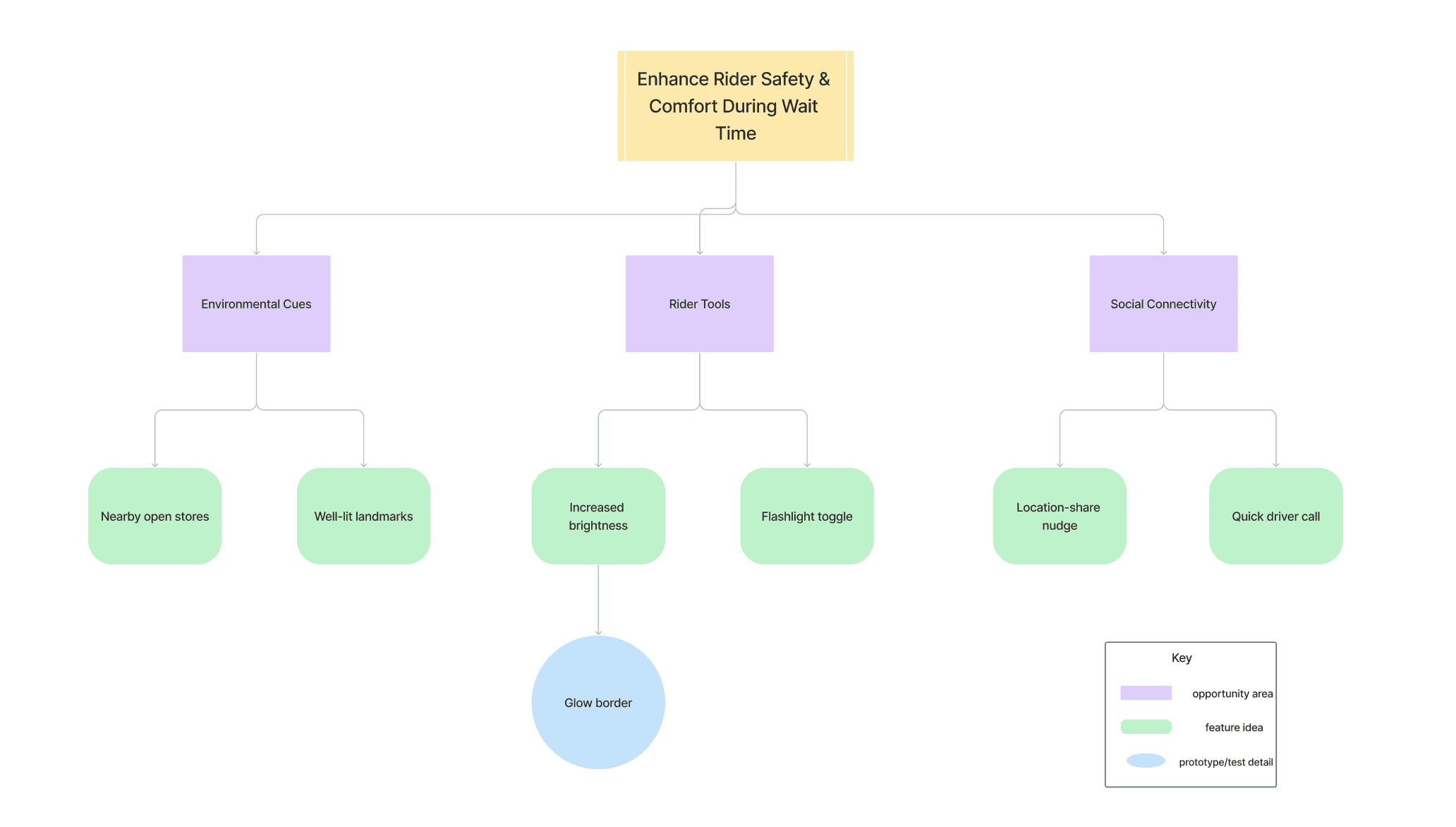
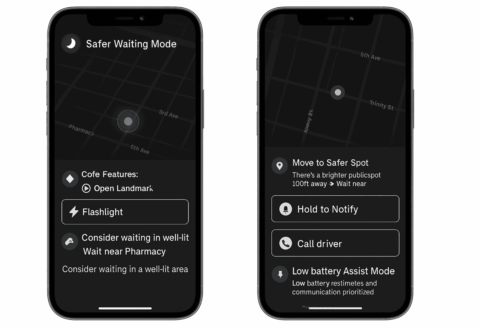
Introducing: Safer Waiting Mode
A contextual, opt-in layer that activates automatically in specific situations:
Late at night
In low-foot-traffic zones
In unfamiliar or dimly lit neighborhoods
The goal? To offer riders lightweight tools to feel visible, reassured, and supported—without disrupting the ride flow.
A contextual, opt-in layer that activates automatically in specific situations:
Late at night
In low-foot-traffic zones
In unfamiliar or dimly lit neighborhoods
The goal? To offer riders lightweight tools to feel visible, reassured, and supported—without disrupting the ride flow.
✦ Core MVP Features
Open Landmark Pins
Open Landmark Pins
Highlights nearby open public places (e.g.,
gas stations, pharmacies) to encourage safer waiting locations.
Highlights nearby open public places (e.g.,
gas stations, pharmacies) to encourage safer waiting
locations.
Share Ride CTA
Share Ride CTA
Prompts riders to notify a trusted contact—especially first-time
or nighttime users.
Prompts riders to notify a trusted contact—especially
first-time or nighttime users.
Flashlight Toggle
Flashlight Toggle
Lets riders illuminate their surroundings without
leaving the app.
Lets riders illuminate their surroundings without
leaving the app.
Open Landmark Pins
A subtle pulsing border that signals Safer Waiting
Mode is active. Calming, not alarming.
A subtle pulsing border that signals Safer Waiting Mode
is active. Calming, not alarming.
✦ Advanced Safety Enhancements
✦ Advanced Safety Enhancements
Iterative Decision-Making Flow
For each feature, I explored multiple concepts:
“Move to Safer Spot” started as a passive banner but tested better as a pop-up
suggestion
Flashlight toggle was placed both at the bottom and above the map; users r
esponded more quickly when it was embedded in the map view
Emergency feature explored icon vs. long-press gesture—users preferred
the gesture for reducing false triggers
Feature-Level Thought Process
Each tool went through:
Why I considered it – rooted in user quotes or patterns
What I tested/sketched – paper mockups, mid-fis in Figma
How users reacted – quotes or observed behaviors
Final design choice – based on feasibility × clarity × emotion
From Ideas to Implementation: My Design Process
Moments of Collaboration &
Insight
User input shaped nearly every interaction:
A tester said: “I keep my screen dim in unfamiliar areas—this glow frame helps me feel visible
without being flashy.”
Another noted: “I wish I had a quick way to know where a store is when I’m feeling anxious waiting.”
Even a friend who reviewed early wireframes pointed out that the ambient UI felt “too gentle to be noticed,” which led me to explore subtle animations.
Move to Safer Spot
Move to Safer Spot
Suggests nearby safer locations if the rider is in a poorly lit or
isolated spot.
Suggests nearby safer locations if the rider is in a poorly
lit or isolated spot.
Suggests nearby safer locations if the rider is in a poorly lit or isolated spot.
Emergency Tap & Hold
Emergency Tap &
Hold
Long-press gesture triggers safety protocols after 3 seconds—
minimizing false alarms while providing rapid escalation
when needed.
Long-press gesture triggers safety protocols after
3 seconds—minimizing false alarms while providing
rapid escalation when needed.
Long-press gesture triggers
safety protocols after 3 seconds — minimizing false alarms while providing rapid escalation when needed.
Smart Call Shortcut
Smart Call Shortcut
Appears when GPS shows the driver is close but not visible.
One tap connects rider and driver quickly.
Appears when GPS shows the driver is close but not
visible. One tap connects rider and driver quickly.
Appears when GPS
shows the driver is
close but not visible.
One tap connects
rider and driver quickly.
Low Battery Assist Mode
Low Battery Assist
Mode
Simplifies the interface below 10% battery to highlight:
Share Ride; Call Driver; ETA to car
Simplifies the interface below 10% battery to
highlight:
Share Ride; Call Driver; ETA to car
Simplifies the interface
below 10% battery to
highlight: Share Ride; Call
Driver; ETA to car
From Ideas to Implementation: My Design Process
Iterative Decision-Making Flow
For each feature, I explored multiple concepts:
“Move to Safer Spot” started as a passive banner but tested better as a pop-up suggestion
Flashlight toggle was placed both at the bottom and above the map; users responded more
quickly when it was embedded in the map view
Emergency feature explored icon vs. long-press gesture—users preferred the gesture for
reducing false triggers
Feature-Level Thought Process
Each tool went through:
Why I considered it – rooted in user quotes or patterns
What I tested/sketched – paper mockups, mid-fis in Figma
How users reacted – quotes or observed behaviors
Final design choice – based on feasibility × clarity × emotion
🚫 Features I Explored But
Didn't Build
Voice-based driver reassurance – felt invasive and trust-eroding
Live police station map – too alarmist, inconsistent with Uber’s tone
Safety status badge system – could create bias or discrimination risk
These were scoped out to keep the design non-intrusive and emotionally neutral.
Feature-Level Thought Process
Each tool went through:
Why I considered it – rooted in user quotes or patterns
What I tested/sketched – paper mockups, mid-fis in
Figma
How users reacted – quotes or observed behaviors
Final design choice – based on feasibility × clarity × emotion
Iterative Decision-Making Flow
For each feature, I explored multiple concepts:
“Move to Safer Spot” started as a passive banner but
tested better as a pop-up suggestion
Flashlight toggle was placed both at the bottom and
above the map; users responded more quickly when it
was embedded in the map view
Emergency feature explored icon vs. long-press gesture
—users preferred the gesture for
reducing false triggers
Moments of Collaboration & Insight
Moments of Collaboration & Insight
User input shaped nearly every interaction:
A tester said: “I keep my screen dim in unfamiliar areas—this glow frame helps me feel visible
without being flashy.”
Another noted: “I wish I had a quick way to know where a store is when I’m feeling anxious waiting.”
Even a friend who reviewed early wireframes pointed out that the ambient UI felt “too gentle to be
noticed,” which led me to explore subtle animations.
Design Considerations included:
High contrast, large touch targets
Language that was neutral and non-alarming
Modular design for temporary, non-intrusive activation
Design Considerations included:
High contrast, large touch targets
Language that was neutral and non-alarming
Modular design for temporary, non-intrusive activation
Translating this into Mid-Fidelity Prototypes
I designed and prototyped three key user flows:
Triggering Safe Waiting Mode - via contextual cues
Interacting with safety tools- flashlight, landmark pins, share ride
Emergency interactions - tap & hold, fallback contact
I designed and prototyped three key user flows:
Triggering Safer Waiting Mode via contextual cues
Interacting with safety tools: flashlight, landmark pins, share ride
Emergency interactions: tap & hold, fallback contact
Translating this into Mid-Fidelity Prototypes
Design Considerations included:
High contrast, large touch
targets
Language that was neutral and
non-alarming
Modular design for temporary,
non-intrusive activation
Translating this into Mid-Fidelity Prototypes
🚫 Features I Explored But Didn't Build
1) Voice-based driver reassurance – felt invasive and trust-eroding
2) Live police station map – too alarmist, inconsistent with Uber’s tone
3) Safety status badge system – could create bias or discrimination risk
These were scoped out to keep the design non-intrusive and emotionally neutral.
Voice-based driver reassurance – felt
invasive and trust-eroding
Live police station map – too
alarmist, inconsistent with Uber’s
tone
Safety status badge system – could
create bias or discrimination risk
These were scoped out to keep the
design non-intrusive and emotionally
neutral.
Iterating Through Testing
#1 Flashlight Toggle: Embedding Utility Without Alarm
Many riders already use their phone flashlight when waiting at night, but toggling between apps
added friction. I explored two placement strategies:
Option 1: Bottom dock toggle next to “Contact Driver”
✅ Familiar location
❌ Users missed it while scanning the mapOption 2: Floating icon embedded in the live map view
✅ Easier visibility and faster interaction
❌ Slight risk of visual clutter
Decision: I chose Option 2, based on rider feedback:
“I look at the map constantly—putting the flashlight there makes way more sense.”
I kept the icon minimal with a soft contrast edge to avoid visual tension in dark mode.
#1 Flashlight Toggle: Embedding Utility Without Alarm
Many riders already use their phone flashlight when waiting at night, but toggling between
apps added friction. I explored two placement strategies:
Option 1: Bottom dock toggle next to “Contact Driver”
✅ Familiar location
❌ Users missed it while scanning the mapOption 2: Floating icon embedded in the live map view
✅ Easier visibility and faster interaction
❌ Slight risk of visual clutter
Decision: I chose Option 2, based on rider feedback:
“I look at the map constantly—putting the flashlight there makes way more sense.”
I kept the icon minimal with a soft contrast edge to avoid visual tension in dark mode.
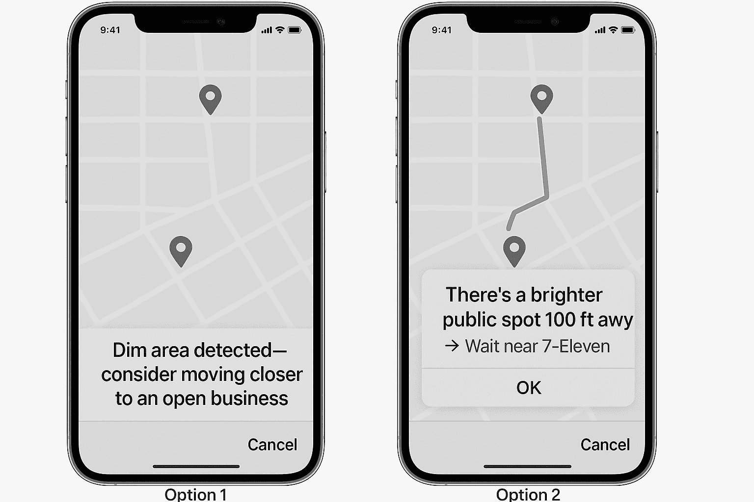
#2 “Move to Safer Spot” Prompt: Passive Suggestion or Active Nudge?:
When GPS detected riders were near low-visibility or closed locations, I wanted to gently suggest
relocating. Two options emerged:
Option 1: Banner below the map saying
“Dim area detected—consider moving closer to an open business.”
✅ Non-intrusive
❌ Most users ignored itOption 2: Pop-up prompt with a route preview, e.g.:
“There’s a brighter public spot 100ft away → Wait near 7-Eleven”
✅ Clearer, actionable
❌ Risked feeling overbearing
Decision: I implemented Option 2 with animation delay and dismiss capability.
Riders appreciated the balance:
“It didn’t feel pushy—it felt like help.”
#2 “Move to Safer Spot” Prompt: Passive Suggestion or Active
Nudge?:
When GPS detected riders were near low-visibility or closed locations,
I wanted to gently suggest
relocating. Two options emerged:
Option 1: Banner below the map saying
“Dim area detected—consider moving closer to an open business.”
✅ Non-intrusive
❌ Most users ignored itOption 2: Pop-up prompt with a route preview, e.g.:
“There’s a brighter public spot 100ft away → Wait near 7-Eleven”
✅ Clearer, actionable
❌ Risked feeling overbearing
Decision: I implemented Option 2 with animation delay and dismiss capability.
Riders appreciated the balance:
“It didn’t feel pushy—it felt like help.”
#2 “Move to Safer Spot”
Prompt: Passive Suggestion
or Active Nudge?:
When GPS detected riders were
near low-visibility or closed
locations, I wanted to gently suggest
relocating. Two options emerged:
Option 1: Banner below the map saying
“Dim area detected—consider moving closer to an open business.”
✅ Non-intrusive
❌ Most users ignored itOption 2: Pop-up prompt with a route preview, e.g.:
“There’s a brighter public spot 100ft away → Wait near 7-Eleven”
✅ Clearer, actionable
❌ Risked feeling overbearing
Decision: I implemented Option 2 with animation delay and dismiss capability.
Riders appreciated the balance:
“It didn’t feel pushy—it felt like help.”
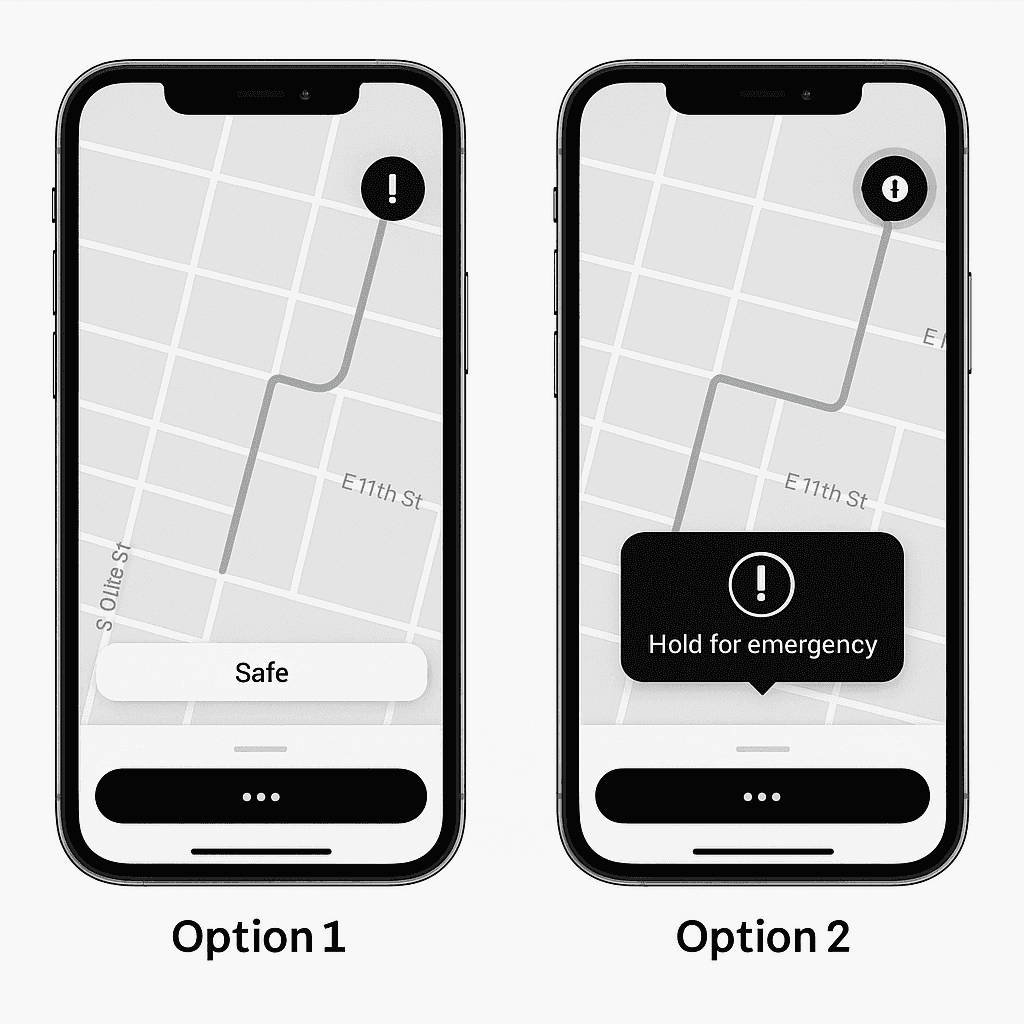
#3 Emergency Tap & Hold: Preventing Accidental Triggers:
Uber already includes an emergency button, but users feared misclicks, especially with one-handed use
. I tested two gestures:
Option 1: Static emergency icon in the corner
✅ High visibility
❌ Risk of accidental taps (especially with thumb scrolling)Option 2: Long-press gesture (3+ seconds) to activate
✅ Reduces false positives
✅ Feels more intentional
❌ Slightly slower access
Decision: I implemented Option 2. Testers preferred the delay:
“I like that it won’t go off if I fumble my phone.”
I added haptic feedback and a soft countdown glow to reinforce the sense of control during activation
This case study was created
independently and is not affiliated
with Uber. Thanks to every rider
who shared a story that helped me
build this ⋆˙⟡
The best UX solutions solve user's emotional pain points
with clear, intentional
interaction.
Reflection: Designing for Emotional Safety
Reflection: Designing for
Emotional Safety
Reflection:
Designing for Emotional Safety
Designing for safety meant balancing visibility with calmness— users wanted to feel supported, not alarmed.
Designing for safety meant balancing visibility with calmness— users wanted to feel
supported, not alarmed.
Designing for safety meant balancing
visibility with calmness— users wanted to feel supported, not
alarmed.
Seemingly small UI choices can have an outsized impact on rider trust & emotional reassurance.
Seemingly small UI choices can have an outsized impact on rider trust
& emotional reassurance.
Seemingly small UI choices can
have an outsized impact on rider
trust & emotional reassurance.
The best UX solutions solve user's emotional pain points with clear, intentional interaction.
The best UX solutions solve user's emotional pain points with clear, intentional
interaction.
This project taught me to design for what users feel, not just what they do:
This project taught me to design for what
users feel, not just what they do:
This case study was created independently and is not affiliated with Uber. Thanks to every rider who
shared a story that helped me build this ⋆˙⟡
This case study was created independently and is not affiliated with
Uber.
Thanks to every rider who shared a story that helped me
build this ⋆˙⟡